The Web Is Still a Material: Reviving a 2018 Project With AI
I revisited a 2018 HTML/CSS learning project with AI. What mattered most wasn't generating code faster—it was the fundamentals, transferable design principles, and human judgment that helped steer the work.
In 2018, I started building a small collection of HTML and CSS experiments. I wanted to see what the browser could do on its own—sometimes with a simple layout, sometimes with a visual trick that seemed to need JavaScript but didn't.
I wasn't trying to build a product. I wanted to understand the material I was working with, take it apart, and make something other people could explore for free.
Recently, I returned to that project and used AI assistance extensively to revive it as a modern learning resource. What stayed with me wasn't the speed of generating code. It was how much the result depended on understanding what to ask, which assumptions to challenge, and how to steer an implementation without losing the original intent.
That's why I'm sharing both the work and the process behind it.
Going back to the beginning
The original project was a snapshot of where I was in my understanding of the web. CSS Grid and Flexbox were changing how developers approached layout. Bootstrap offered a practical example of what happens when you stop reinventing every component. CSS itself was becoming capable of more expressive effects.
Each little experiment was meant to answer a question. Why choose Grid rather than Flexbox? What does a real framework give you? Could a scene zoom toward a mountain, let the clouds disappear, and then zoom back out without an application script?
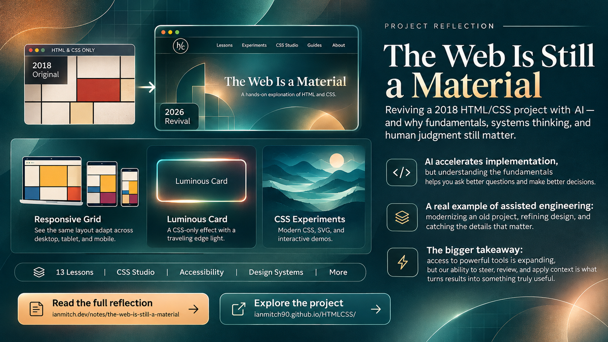
Looking back, the code was imperfect. Some assets depended on outside services, the examples didn't form a cohesive learning journey, and the site looked its age. But the questions were worth preserving. I wanted to keep the original source available while giving the ideas a better home.
You can still inspect the archived original project. It isn't hidden behind the modern version.
What the revival became
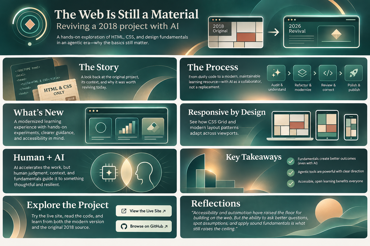
The new resource is called The Web Is a Material. It includes 13 standalone lessons, responsive design exercises, a dedicated accessibility guide, native interaction examples, SVG and modern CSS experiments, and a practical introduction to libraries and design systems.
It also has a CSS-only studio: luminous cards, an ambient halo, a traveling edge of light, an animated vector, a small chart and a mini-game driven by browser-native controls. These demonstrations are intentionally limited in scope. The surrounding lessons explain when CSS is enough and when JavaScript, a backend, or a purpose-built library becomes the more responsible choice.
The architecture itself is part of the teaching. The guide is a collection of actual HTML pages, not a Next.js application or a client-side router impersonating separate documents. A learner can clone the repository, serve the directory, follow ordinary links, inspect stylesheets and start changing things without first learning a build framework.
That simplicity is deliberate. Understanding the browser isn't the opposite of using advanced tools; it's a foundation for choosing them.
Small corrections can reveal the real engineering problem
One of the revealing moments came when a navigation link appeared on some pages but not others. It's a minor oversight on the surface. But the right fix depended on knowing that these were independent HTML documents, not routes whose navigation was automatically shared by a framework.
“Fix the navbar” is a reasonable request, but it's underspecified. “This is a static multi-page site; add the link consistently without introducing a router” expresses the actual constraint. The second instruction is more likely to produce a focused correction and fewer unrelated changes.

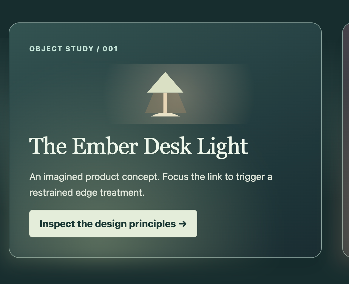
A different example involved a luminous card. The visual intent was a narrow light traveling around a stationary edge. An early implementation rotated the treatment itself, and the motion felt disconnected from the card. The revision separated the card surface from a distinct edge track so that only the light traveled.
What mattered here wasn't whether the first result was obviously broken. It looked plausible. But it wasn't the behavior I had in mind. Plausible output and intended behavior are not the same thing.
There was a similarly subtle distinction in the responsive Grid example. Shrinking a device-shaped frame doesn't necessarily demonstrate responsive design. The final experience uses embedded documents with actual CSS viewport breakpoints, so the layout changes rather than merely scaling a picture.
Those are ordinary engineering decisions. But they're good examples of how a more precise understanding of the system leads to better steering, a smaller change surface and clearer review.
Bringing the right context between projects
Another important part of this revival was that I didn't begin with a blank slate. I brought lessons from an active personal software project where I've spent considerable time shaping a design system, an engineering practice, review patterns and an approach to reusable interaction details.
I didn't copy that project's private implementation into a teaching repository. I selectively adapted broad ideas—such as restrained ambient light, layered surfaces, accessible interaction and deliberate motion—to generic educational examples. The purpose was to explain a visual technique, not reproduce a product.
This is one of the practical advantages of developing your own principles over time. They become reusable context. Once you can describe what a component should communicate, what should remain invariant, which layers are decorative, and what accessibility constraints matter, a new collaborator can work from a much stronger starting point.
The same reasoning applies to working with an AI coding agent. A focused brief, a clear project structure, representative examples and a few engineering rules often provide more leverage than giving a tool a sprawling list of preferences without context.
There are increasingly sophisticated agent skills, plugins, reference libraries and orchestration frameworks available. I find those developments interesting, and I expect to share more of my own design and engineering practices over time. But I don't think the first question should always be, “Which new framework or skill do I install?”
A better question is: What knowledge and constraints does this task actually need? Start with a good foundation. Introduce a reusable procedure, tool or skill when it solves a real repeated problem. An agent that has been given the relevant context can make strong progress without requiring a giant custom system for every small experiment.
Generating code isn't the same as steering a system
AI coding assistants can examine repositories, propose structure, write components, run tests and make meaningful changes very quickly. But their context is always bounded in some way. They can only work from the instructions, files, references and observations available to them.
Where an important decision is unstated, an assistant makes an assumption. That assumption might be excellent—or simply the most conventional interpretation of incomplete information.
The difficult part isn't always finding code that doesn't run. It's noticing code that works but answers a subtly different question. Is an interaction decorative or essential? Is the source meant to teach the platform or hide the platform? Is a preview actually responsive? Does a library example need to demonstrate the real library?
That's why human review isn't merely checking for errors after code generation. It can be an ongoing act of clarifying goals, diagnosing assumptions, deciding which abstraction belongs, and transferring knowledge from one iteration into the next.
The more capable our tools become, the more important it is to know what to ask of them—and what a good answer should actually do.
The fundamentals matter across experience levels
One of the most exciting developments in software is that more people can now try building something useful. A person without a technical background can go from an idea to a functioning prototype much faster. A newer engineer can explore unfamiliar tools more confidently. Experienced engineers can delegate repetitive work and spend more time on architecture, product decisions and integration.
I see that broader access as a good thing. But easier implementation doesn't automatically supply all the understanding needed to evaluate a result.
A page may feel wrong because of its semantic structure, focus behavior, responsive layout or loading strategy. A newcomer might not know those are even distinct questions. Experienced engineers have their own blind spots when moving into new areas. No one is exempt from learning.
So I don't want this to become another “vibe coding versus engineering” argument. People have different needs and different levels of experience. The more constructive question is how we help people investigate, recognize tradeoffs and ask increasingly useful questions.
Learning fundamentals gives us more paths into a problem. It helps us recognize when a tool is saving effort, when an abstraction is obscuring something important, and when a result deserves another pass.
Learning the primitives doesn't mean reinventing every wheel
A recurring theme in the new guide is that understanding HTML and CSS should make us better users of libraries, not suspicious of them. Bootstrap, Tailwind, Material UI, Fluent UI, accessibility primitives and larger design systems solve different kinds of problems.
An established component library can package years of testing, interaction conventions and maintenance decisions. That's real value. But understanding semantic HTML, layout, performance and accessible behavior helps you choose the right tool, troubleshoot it and understand what remains your responsibility.
Someone casually exploring the web shouldn't have to learn every library to get started. A developer building something production-facing should understand the tradeoffs before adopting one. The curriculum makes room for both.
The original project was partly about the delight of realizing what CSS could do. Modern CSS and SVG have pushed those possibilities much further. But a clever visual effect still needs usable controls, reasonable performance and alternatives when animation or special rendering isn't appropriate.
AI assistance is part of the history, not a secret
I used AI extensively to revive this repository. That includes generating and reorganizing code, shaping lessons, checking links, revising components, and working through multiple rounds of visual and architectural feedback.
I did not manually write every line of the modern version, and I don't want to imply otherwise. I also did not simply accept every implementation unchanged. I reviewed how the project was structured, absorbed details that informed later decisions, and redirected the work where something didn't quite match its purpose.
That interaction is part of the story. You can inspect the open source repository and the revival pull request rather than being asked to take a polished finished artifact on faith.
Why I'm sharing it
This is a small project, deliberately so. It's a free learning resource, a preserved piece of my history with frontend development, and a concrete example of learning in public with AI-assisted tools.
I expect to share more experiments, including work involving agentic development and engineering workflows. Some will be small investigations like this one; others will have more moving parts. I want to share the reasoning, the useful mistakes and the decisions—not only the final screenshots.
If someone with no development background leaves understanding a little more about how a browser works, that matters. If a developer finds a reminder to inspect assumptions and make more focused changes, that matters too.
The web is still a material worth understanding. More capable tools give us more ways to work with it. Our context, curiosity and judgment help us decide what to make.
Explore the live learning resource, browse the current source, or look back at the original 2018 project. It's free to study, clone and change.
- HTML
- CSS
- AI-assisted engineering
- Learning in public
- Design systems
- Frontend